Dave is a unique British entertainment channel, conceived as the first broadcast disruptor. But, as the channel evolved into original and exclusive comedy, the brand identity no longer reflected the quality and tone of the content. UKTV Creative set out to capture the true spirit of Dave through an irreverent and playful system, shaking up the conventions of linear TV while future-proofing the brand for years to come.
Dave is a very different place to where we were 5 years ago, so we were tasked with the challenge of creating a fresh new look and feel. To evolve the Dave brand to better reflect the content we are putting out today.
Dave is a very different place to where we were 5 years ago, so we were tasked with the challenge of creating a fresh new look and feel. To evolve the Dave brand to better reflect the content we are putting out today.
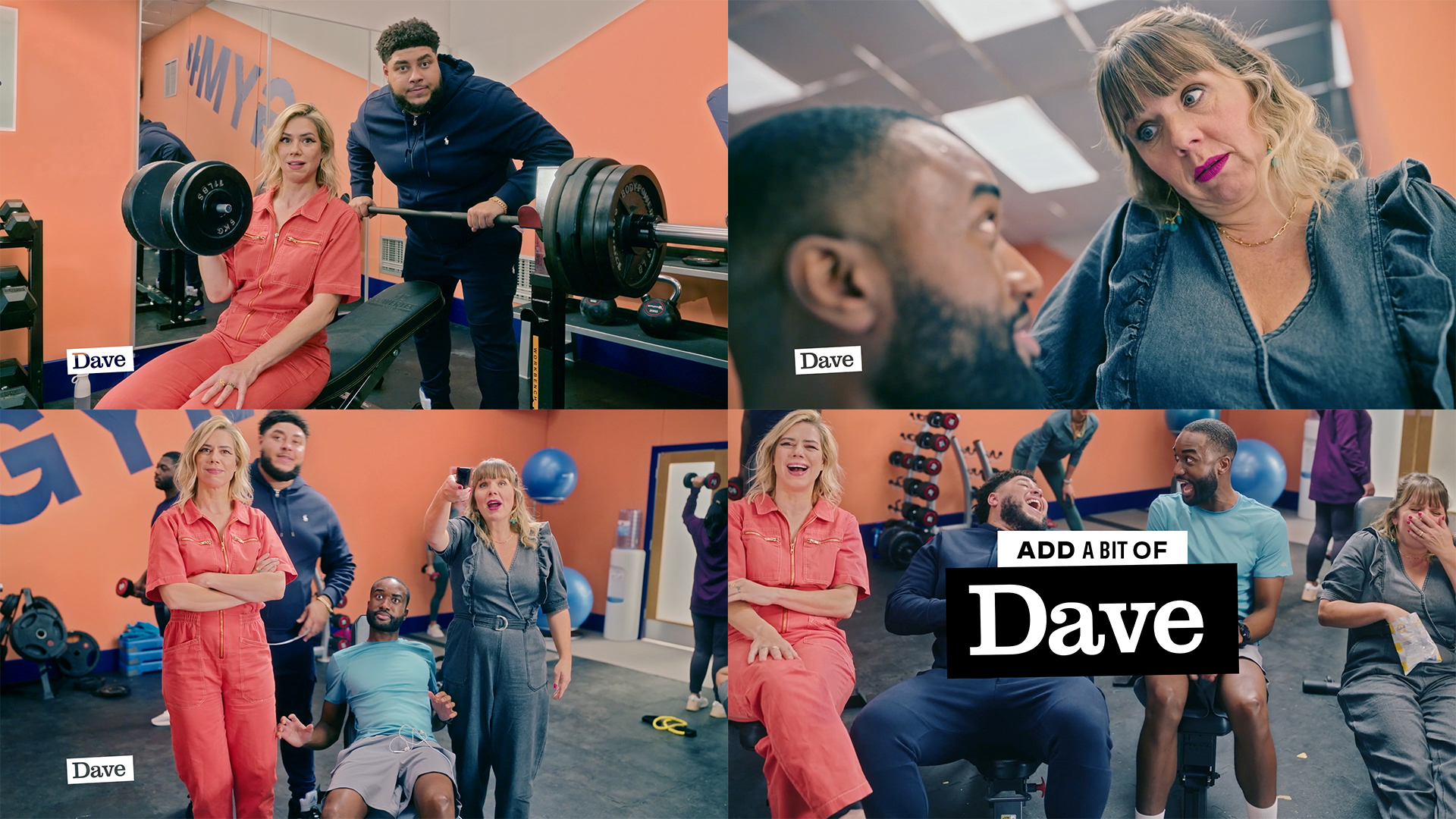
We wanted to take the Dave tone-of-voice – the smart, comic, conversational brand that we’ve seen on our social channels, in partnerships and of course in our shows – and apply it to the biggest canvas of all – Everyday Life.
Spurred on by Dave’s brand belief that ‘humour is a damn good antidote to the awkward mess that is modern life’, our aim was to create a brand which prods, pokes and subverts the world around us.
Forget the super-slick category conventions of TV branding. In Dave’s world, mistakes can happen. Frailty is on show. Flaws are celebrated. A brand that celebrates the joy of everyday life, and helps you ‘find the funny’ through authentic observations of relatable moments.
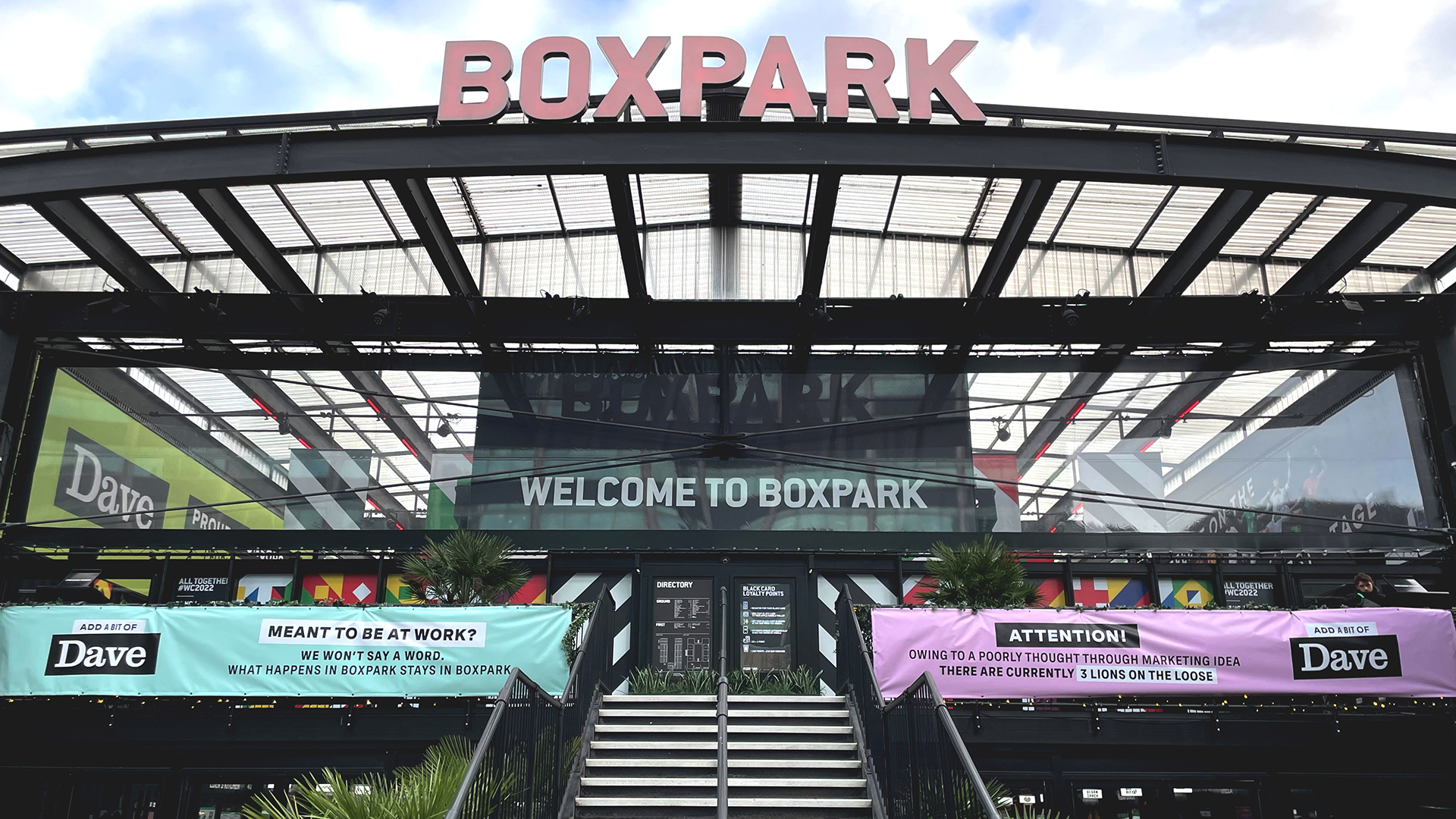
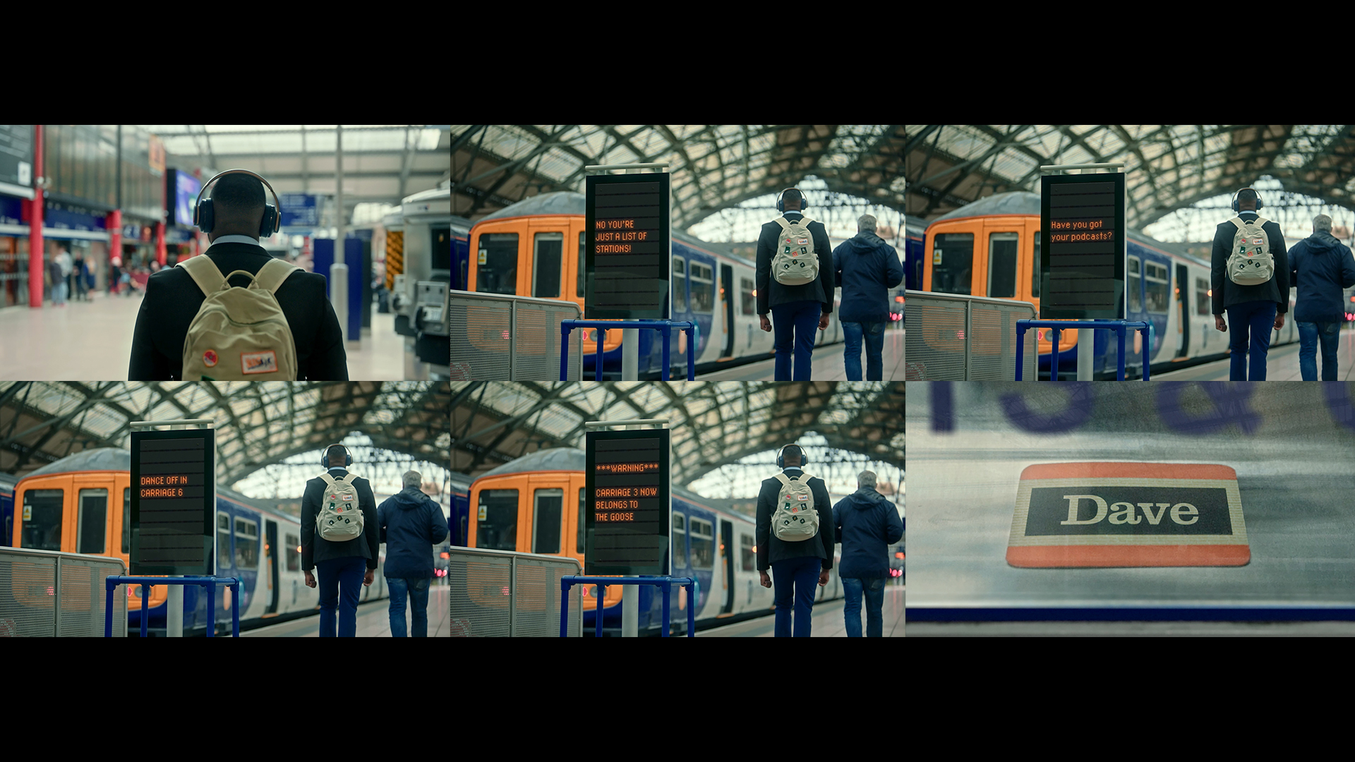
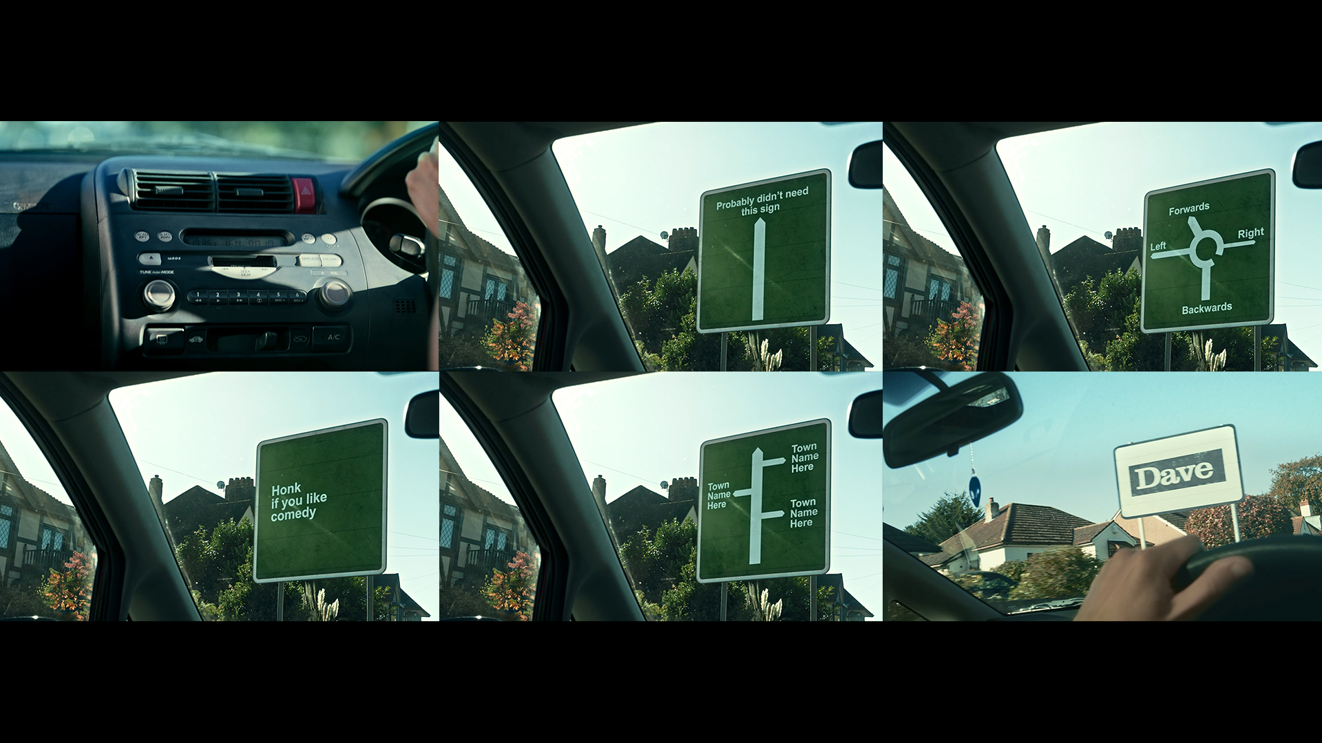
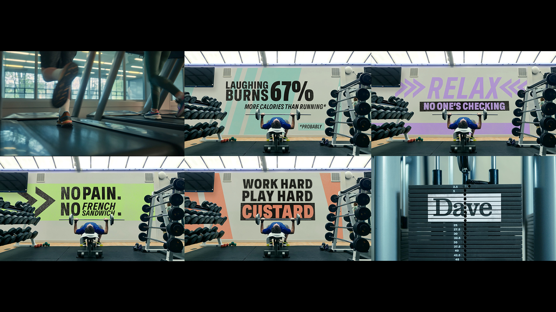
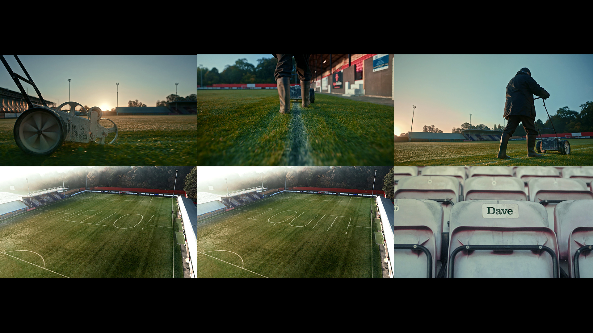
We wanted to put Dave into the world of our viewers. Out there – where we resonate most and shine best as a brand. We wanted to offer a fresh fix of funny in Everyday Life.
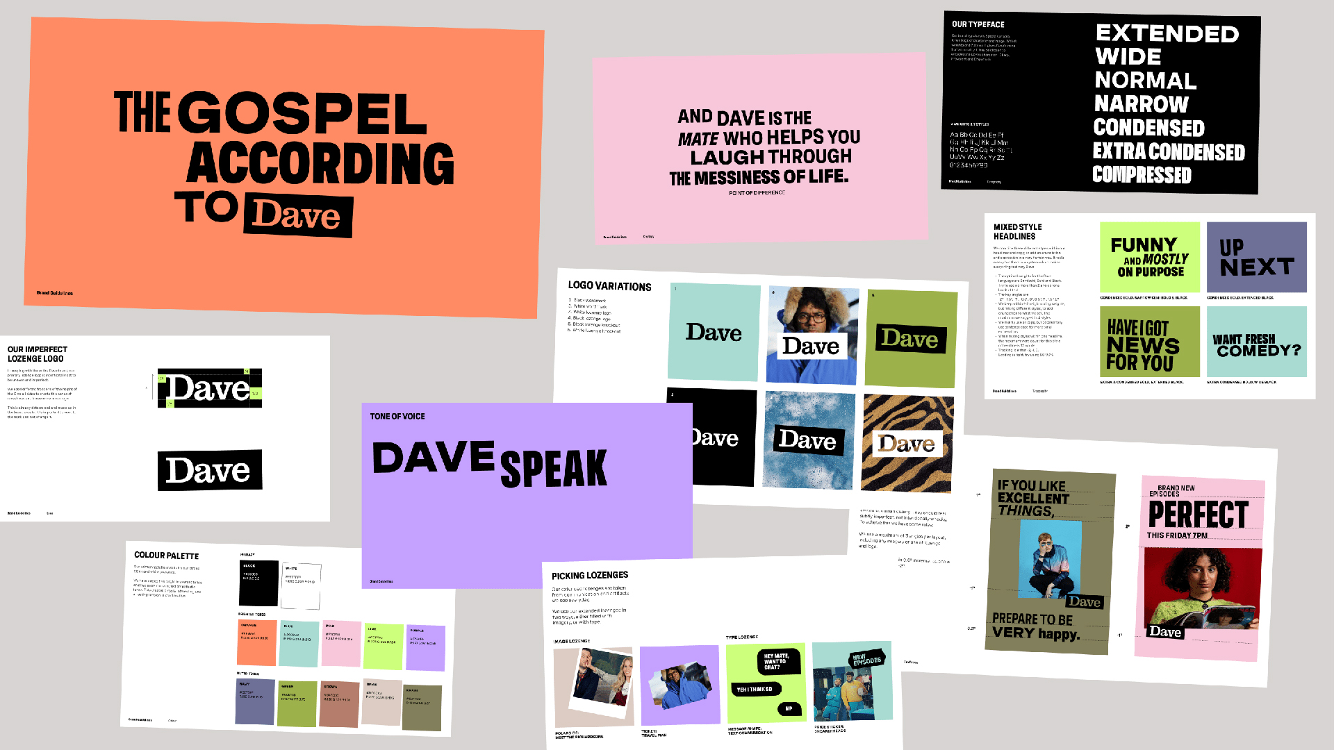
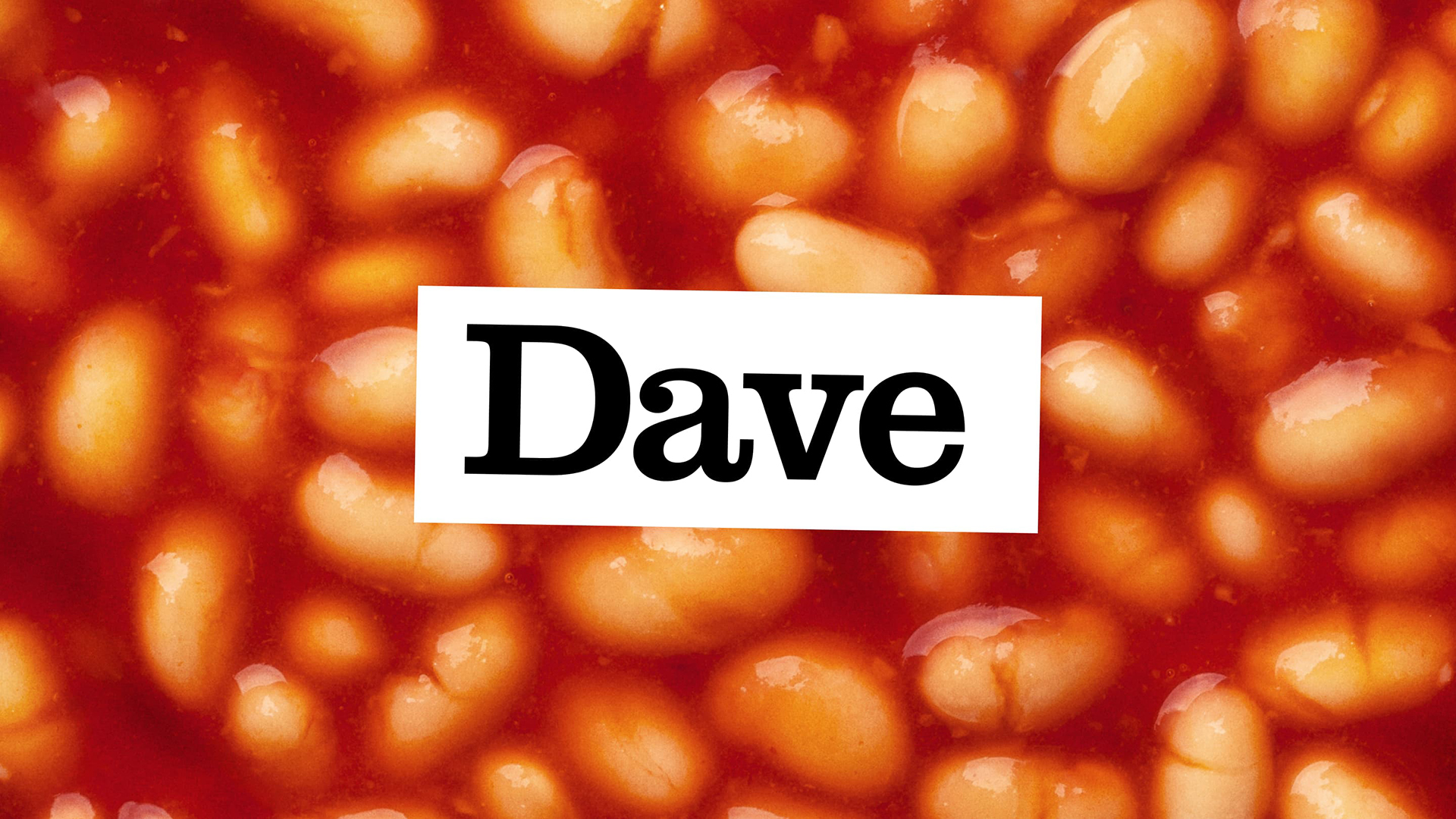
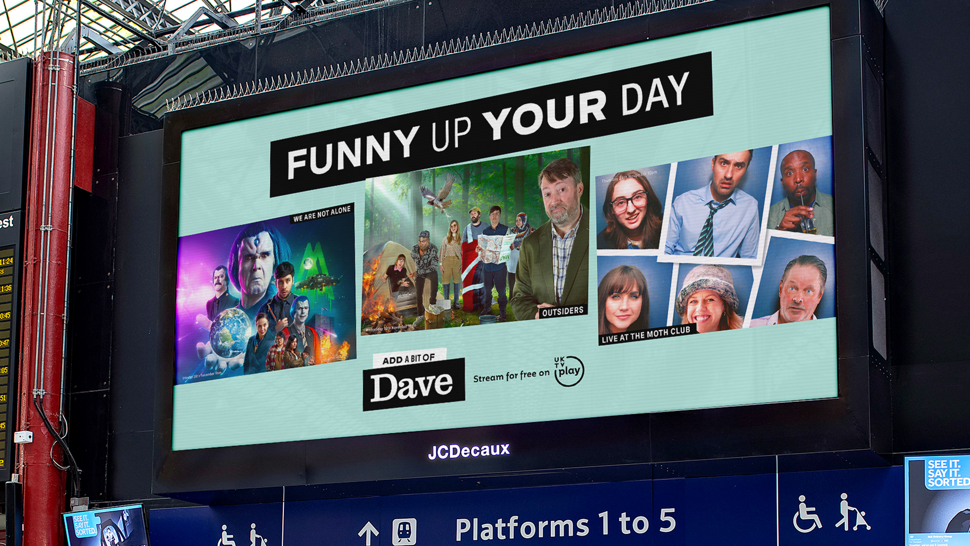
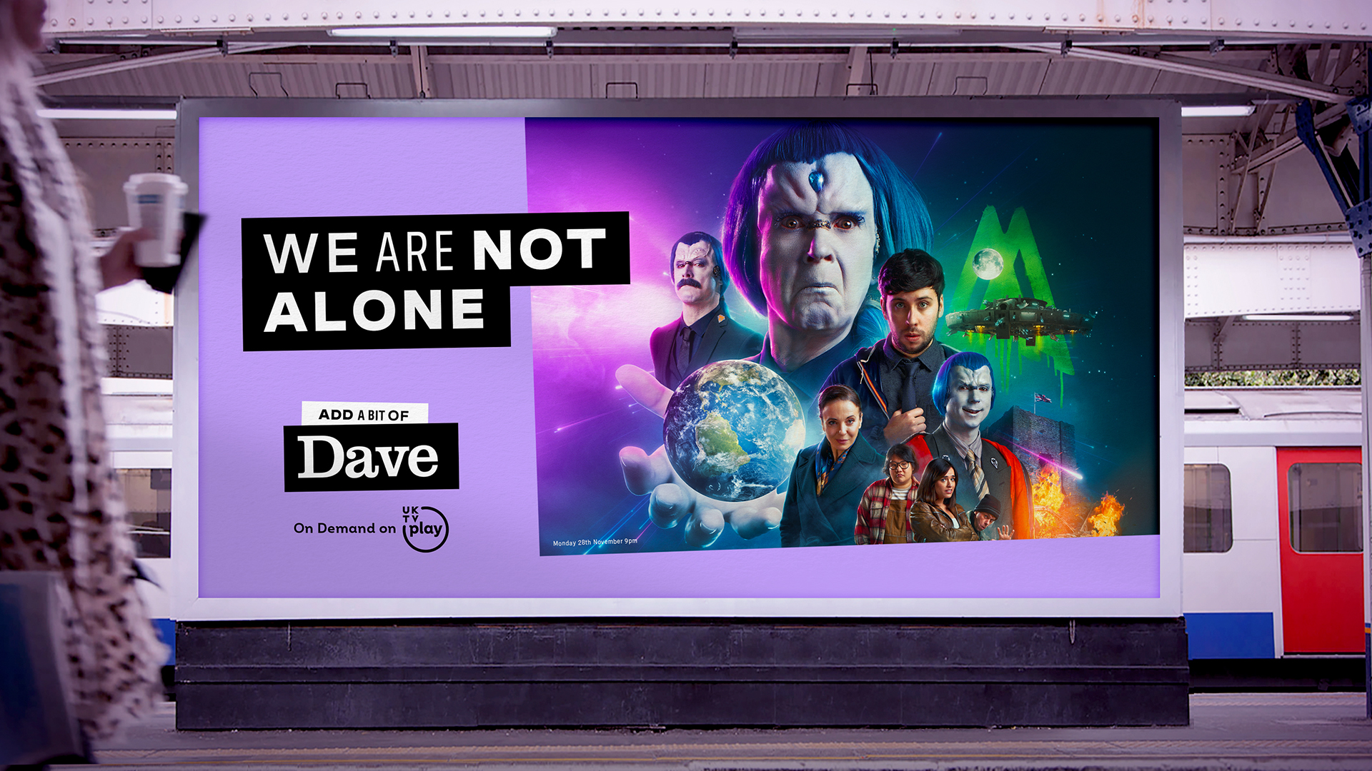
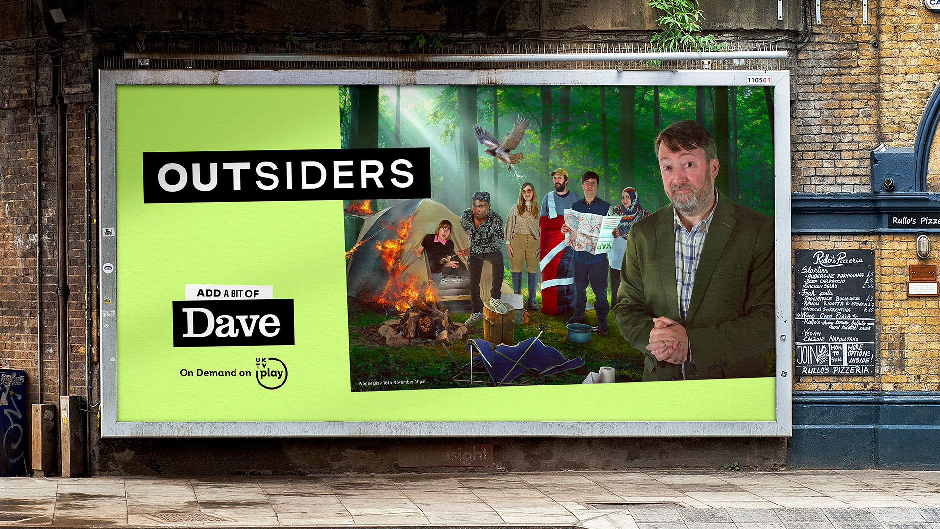
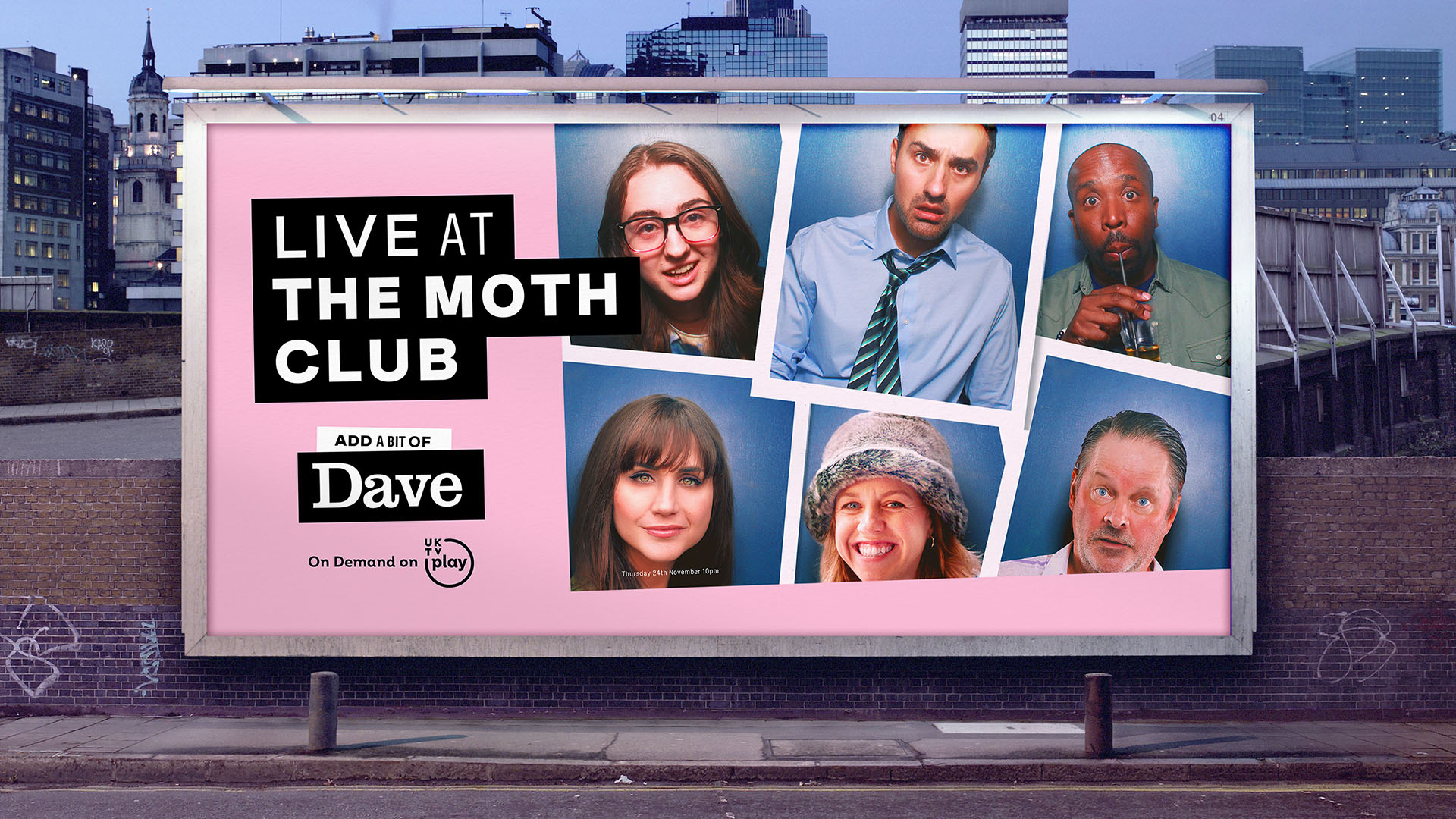
To evolve the Dave brand, we needed a design system that was fit for purpose and helped to opened up a new ‘world’ of Dave. From telly and YouTube, to podcasts and TikToks. So, to freshen things up we created a whole new suite of branded assets – starting with an evolution of the Dave logo.
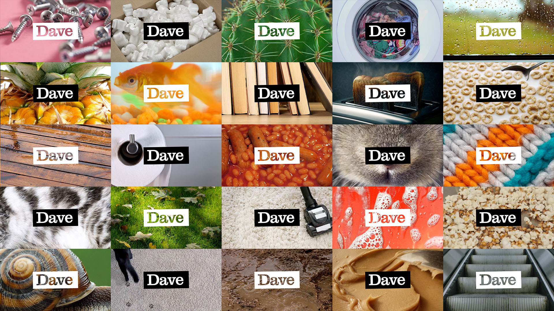
We retained the brand equity and recognition of the original logo but evolve it with a simple build, housing it in a container, so it now acts as a window into Everyday Life.
We also introduced a set of photographic textures that will be used as backgrounds to add texture, colour and an extra conceptual layer to our assets.
We wanted to retain Dave’s strong impactful use of black and white, but have now introduced a secondary set of vibrant colours taken from the modern world.
A new typeface family is introduced, comprising a variety of weights and styles which give us a wide range of different ways to converse with our audience. Type is expressive and tonally varied like a real voice. We can build expression into everything we say, dealing up and down for different effect.
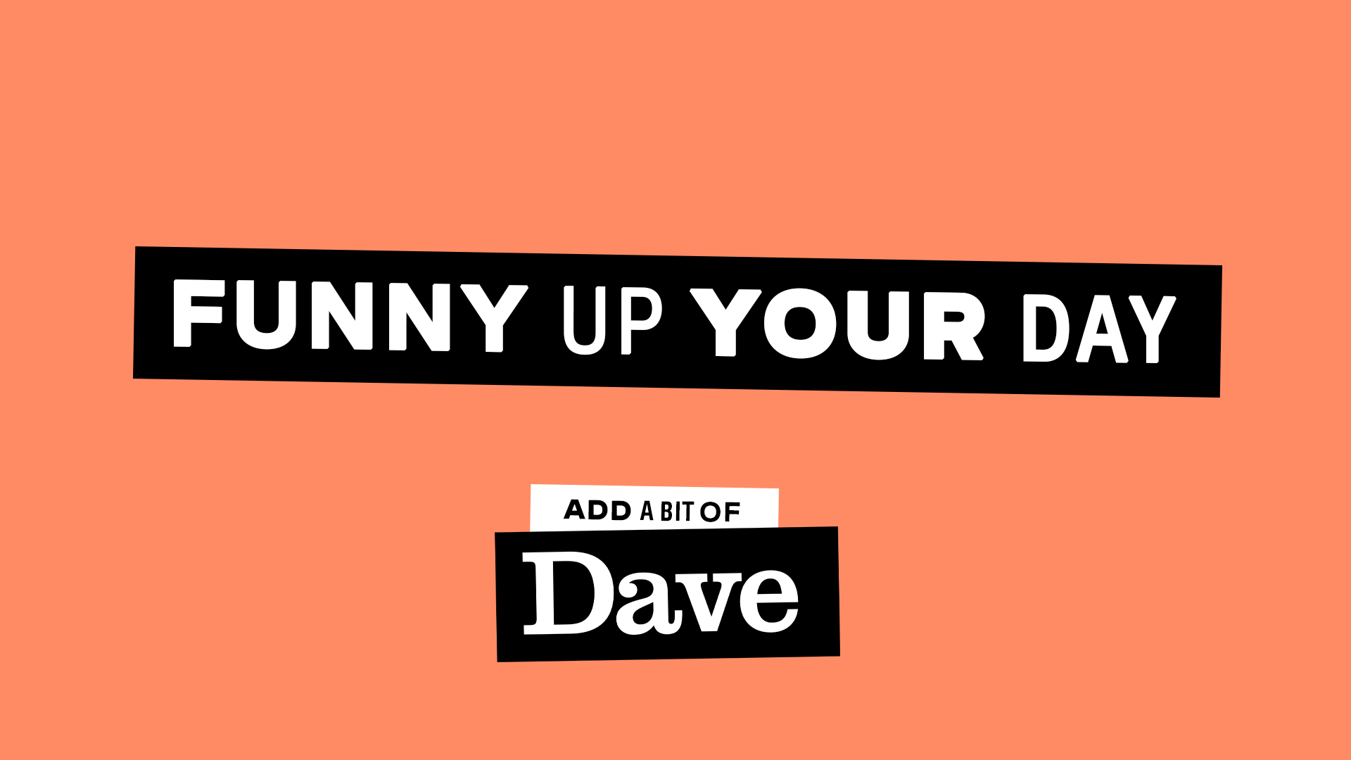
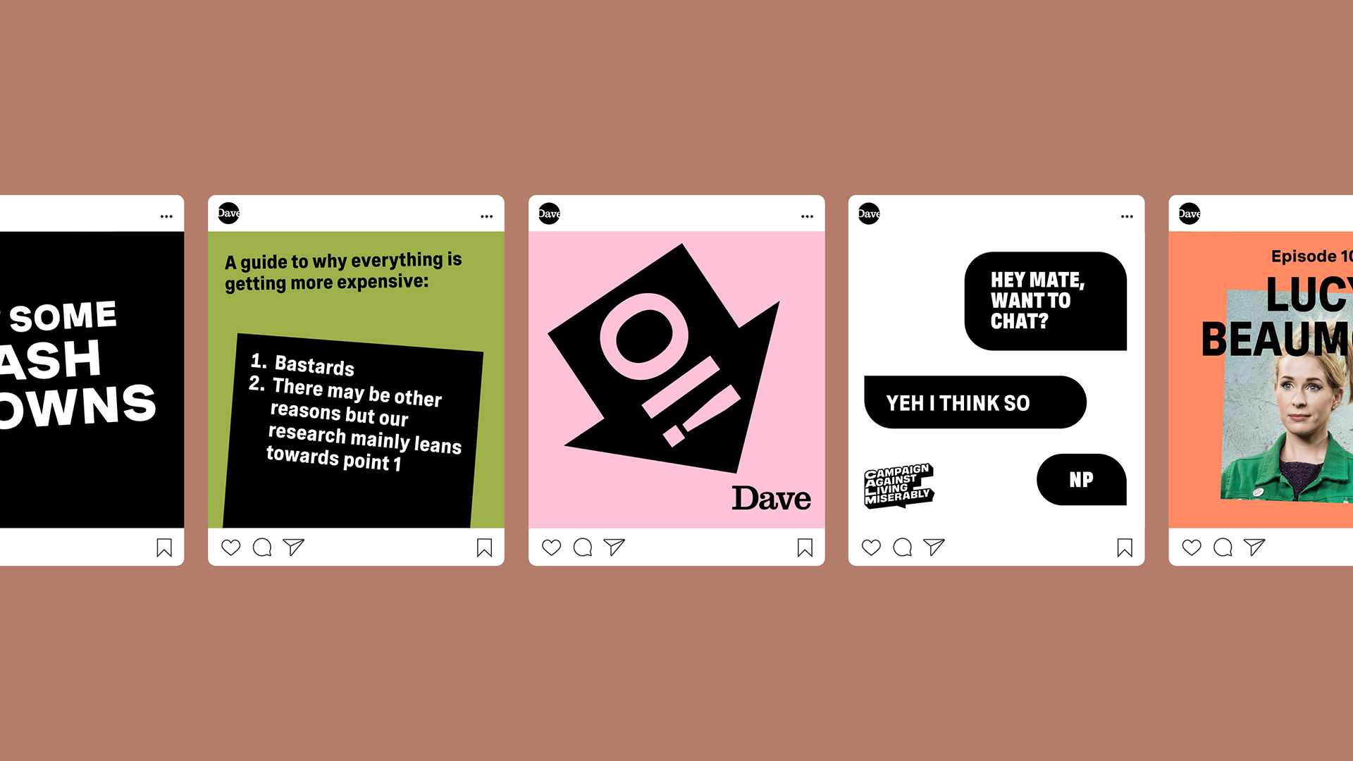
To allow for more flexibility across our brand executions, we have introduced a series of lozenge shapes that enable us to contain type and messaging – as well a way of framing footage and imagery.
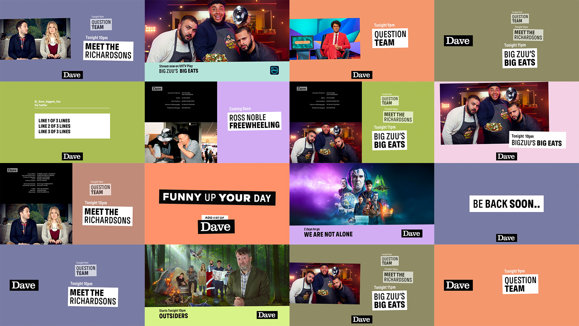
This design system can be used freely, allowing for more variety and flexibility across our on-air, off-air and social media templates. It also helps to create visual consistency across the brand, ensuring everything always feels distinctly Dave.
Our idents will become a bank of updatable real-world videos. This allows us to keep updating them with new copy and content, keeping them fresh and helping us all to laugh through the messiness of everyday life.
A brand that shakes up the conventions of telly.
It’s a new dawn, it’s a new Dave.